Consanguineous conundrum
- POETRY
- April 23, 2022

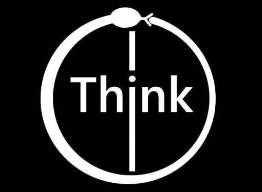
The dividing bar in the middle splits the logo into two. This represents the duality of nature and our mind: male-female, ying-yang, good-evil. The black and white colors are chosen to reflect the same principle.
The dot of the letter i, the third and middle letter of the word 'think', stands for the balance of life, the mind and the universe. The path of balance is very delicate, shown by the small size of the dot, but eventually leads us to enlightenment.
Thus, when we think wisely, and without limitations, we can contribute to society in a manner beneficial to all.